UI/UX Case Study: E-Commerce Product Page for a Camera Store
UX / UI
5 Min Read
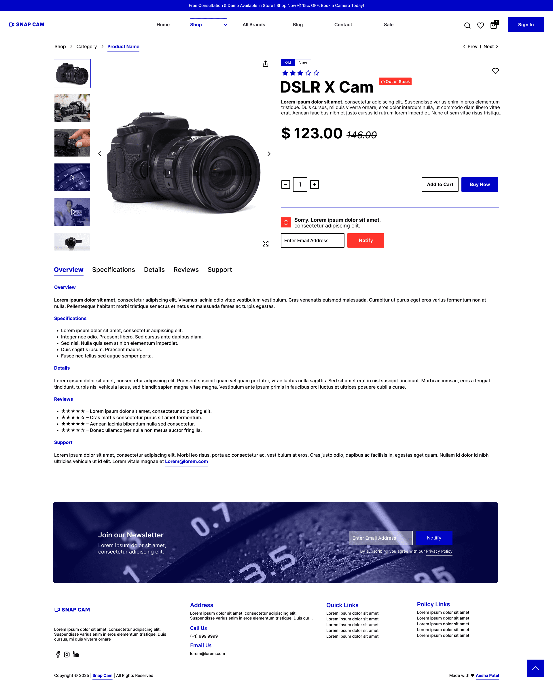
This project involved designing a product detail page for an e-commerce platform specializing in cameras and photography gear. The goal was to create a user-friendly, conversion-driven interface that provides all essential product information while maintaining a clean, modern aesthetic.

🎯 Project Overview
This project involved designing a product detail page for an e-commerce platform specializing in cameras and photography gear. The goal was to create a user-friendly, conversion-driven interface that provides all essential product information while maintaining a clean, modern aesthetic.
👥 Target Audience
Amateur and professional photographers
Tech-savvy consumers looking for high-end camera equipment
Users comparing features, reviews, and warranties before purchase
🧩 Problem Statement
Many e-commerce product pages overwhelm users with cluttered layouts or underemphasize important purchase drivers like reviews, shipping info, or product imagery. The challenge was to present all critical purchase details in a visually balanced, developer-friendly, and mobile-responsive layout.
✅ Goals
Prioritize key decision-making information: product visuals, pricing, ratings, and warranties
Create a visually engaging and conversion-optimized layout
Ensure clarity, trust, and accessibility throughout the page
Design components that scale across devices with minimal developer friction
🛠️ Design Process
1. Wireframing & Structure Planning
Defined a clean hierarchy: Image → Info → Description → Reviews → Additional Info
Ensured thumb-friendly layouts for mobile, using responsive grids
2. UI Design Decisions
Color Palette: Neutral greys with a pop of red for CTAs (consistent with tech/retail aesthetics)
Typography: Clean sans-serif fonts for readability and modernity
Imagery: Used high-quality placeholders to simulate real camera photos
CTAs: “Add to Cart” and “Subscribe” buttons are bold and placed where user attention peaks
3. UX Enhancements
Hover-zoom effect on main product image for engagement
Thumbnail carousel for additional views
Collapsible review section to avoid scroll fatigue
Tabbed/accordion layout for warranty & shipping info to save vertical space
Email subscription field both mid-page and in footer to increase opt-ins
🔍 Key Features
Sticky Header
Ensures easy access to navigation while browsing content.
Ratings & Reviews
Builds trust and informs buying decisions.
Shipping & Warranty Info
Reduces friction by addressing policy uncertainties.
Responsive Layout
Enhances user experience across all screen sizes.
Clean CTA Hierarchy
Clearly guides users through desired action paths.
📈 Results & Learnings
The structure successfully minimized cognitive load while presenting a content-rich product page.
Strong visual hierarchy led to better scannability and engagement.
Accessibility considerations (color contrast, font sizes, button tap areas) ensured inclusivity.
🎨 Tools Used
Figma – UI Design & Prototyping
Unsplash – Placeholder Imagery
Lucide Icons – Clean iconography
Lorem Ipsum – Temporary content text
💡 Reflection
This project emphasized the importance of content organization and user trust in e-commerce design. Designing with both the user and developer in mind allowed for a balance between aesthetics and feasibility. Next steps would include user testing and A/B testing CTAs and layout variations.


